
What is Responsive Web Design?
반응 형 웹 디자인이란 무엇입니까?
Responsive Web Design is about using HTML and CSS to automatically resize, hide, shrink, or enlarge, a website, to make it look good on all devices (desktops, tablets, and phones):
반응 형 웹 디자인은 HTML과 CSS를 사용하여 웹 사이트의 크기를 자동으로 조정, 숨기기, 축소 또는 확대하여 모든 장치 (데스크톱, 태블릿, 휴대 전화)에서 잘 보이도록합니다.
Note : A web page should look good on any device!
참고 : 웹 페이지는 모든 장치에서 잘 보일 것입니다 !
Setting The Viewport
뷰포트 설정하기
When making responsive web pages, add the following <meta> element in all your web pages:
반응 형 웹 페이지를 만들 때 <meta>모든 웹 페이지에 다음 요소를 추가하십시오 .
This will set the viewport of your page, which will give the browser instructions on how to control the page's dimensions and scaling.
이렇게하면 페이지의 뷰포트가 설정되어 브라우저에서 페이지의 크기 및 배율을 제어하는 방법에 대한 지침을 제공합니다.
Here is an example of a web page without the viewport meta tag, and the same web page with the viewport meta tag:
다음은 뷰포트 메타 태그가 없는 웹 페이지 와 뷰포트 메타 태그가 있는 동일한 웹 페이지의 예 입니다 .
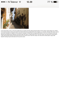
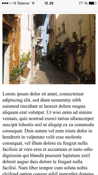
Tip : If you are browsing this page with a phone or a tablet, you can click on the two links above to see the difference.
도움말 : 휴대 전화 또는 태블릿으로이 페이지를 탐색하는 경우 위의 두 링크를 클릭하여 차이점을 확인할 수 있습니다.
Responsive Images
반응 형 이미지
Responsive images are images that scale nicely to fit any browser size.
반응 형 이미지는 모든 브라우저 크기에 맞게 확장되는 이미지입니다.
Using the width Property
width 속성 사용
If the CSS width property is set to 100%, the image will be responsive and scale up and down:
CSS width속성을 100 %로 설정하면 이미지가 반응하고 확대 및 축소됩니다.

Notice that in the example above, the image can be scaled up to be larger than its original size. A better solution, in many cases, will be to use the max-width property instead.
위의 예에서 이미지의 크기를 원래 크기보다 크게 조정할 수 있습니다. 대부분의 경우 더 나은 해결책은 max-width대신 속성 을 사용하는 것입니다.
Using the max-width Property
max-width 속성 사용
If the max-width property is set to 100%, the image will scale down if it has to, but never scale up to be larger than its original size:
경우 max-width속성을 100 %로 설정하면 이미지는가있는 경우 축소,하지만 원래 크기보다 크게 확장하지 않습니다 :

Show Different Images Depending on Browser Width
브라우저 너비에 따라 다른 이미지 표시
The HTML <picture> element allows you to define different images for different browser window sizes.
HTML <picture>요소를 사용하면 브라우저 창 크기에 따라 서로 다른 이미지를 정의 할 수 있습니다.
Resize the browser window to see how the image below change depending on the width:
브라우저 창 크기를 조정하여 너비에 따라 이미지가 어떻게 달라지는 지 확인하십시오.

Example
1 2 3 4 5 6 | <picture> <source srcset="img_smallflower.jpg" media="(max-width: 600px)"> <source srcset="img_flowers.jpg" media="(max-width: 1500px)"> <source srcset="flowers.jpg"> <img src="img_smallflower.jpg" alt="Flowers"> </picture> | cs |
Responsive Text Size
반응 형 텍스트 크기
The text size can be set with a "vw" unit, which means the "viewport width".
텍스트 크기는 "뷰포트 너비"를 의미하는 "vw"단위로 설정할 수 있습니다.
That way the text size will follow the size of the browser window:
그렇게하면 텍스트 크기가 브라우저 창의 크기를 따릅니다.
Hello World
Resize the browser window to see how the text size scales.
Viewport is the browser window size. 1vw = 1% of viewport width. If the viewport is 50cm wide, 1vw is 0.5cm.
뷰포트는 브라우저 창 크기입니다. 1vw = 뷰포트 너비의 1 %. 뷰포트의 너비가 50cm이면 1vw는 0.5cm입니다.
Media Queries
미디어 쿼리
In addition to resize text and images, it is also common to use media queries in responsive web pages.
텍스트 및 이미지의 크기를 조정하는 것 외에도 반응 형 웹 페이지에서 미디어 쿼리를 사용하는 것이 일반적입니다.
With media queries you can define completely different styles for different browser sizes.
미디어 쿼리를 사용하면 브라우저 크기에 따라 완전히 다른 스타일을 정의 할 수 있습니다.
Example: resize the browser window to see that the three div elements below will display horizontally on large screens and stacked vertically on small screens:
예 : 브라우저 창 크기를 조정하면 아래의 세 div 요소가 큰 화면에 가로로 표시되고 작은 화면에 세로로 표시됩니다.
Example
1 2 3 4 5 6 7 8 9 10 11 12 13 14 15 16 17 18 | <style> .left, .right { float: left; width: 20%; /* The width is 20%, by default */ } .main { float: left; width: 60%; /* The width is 60%, by default */ } /* Use a media query to add a breakpoint at 800px: */ @media screen and (max-width: 800px) { .left, .main, .right { width: 100%; /* The width is 100%, when the viewport is 800px or smaller */ } } </style> | cs |
Tip : To learn more about Media Queries and Responsive Web Design, read our RWD Tutorial.
팁 : 미디어 쿼리 및 반응 형 웹 디자인에 대한 자세한 내용은 RWD 자습서를 참조하십시오 .
Responsive Web Page - Full Example
반응 형 웹 페이지 - 전체 예제
A responsive web page should look good on large desktop screens and small mobile phones.
응답 성이 뛰어난 웹 페이지는 대형 데스크탑 화면과 소형 휴대 전화에서 잘 보입니다.

Responsive Web Design - Frameworks
반응 형 웹 디자인 - 프레임 워크
There are many existing CSS Frameworks that offer Responsive Design.
반응 형 디자인을 제공하는 많은 기존 CSS 프레임 워크가 있습니다.
They are free, and easy to use.
그들은 무료이며 사용하기 쉽습니다.
Using W3.CSS
W3.CSS 사용
A great way to create a responsive design, is to use a responsive style sheet, like W3.CSS
반응 형 디자인을 만드는 가장 좋은 방법은 W3.CSS 와 같은 반응 형 스타일 시트를 사용하는 것 입니다.
W3.CSS makes it easy to develop sites that look nice at any size; desktop, laptop, tablet, or phone:
W3.CSS를 사용하면 어떤 크기에서도 멋지게 보이는 사이트를 쉽게 개발할 수 있습니다. 데스크톱, 노트북, 태블릿 또는 휴대 전화 :

Example
1 2 3 4 5 6 7 8 9 10 11 12 13 14 15 16 17 18 19 20 21 22 23 24 25 26 27 28 29 30 31 32 33 34 35 36 | <!DOCTYPE html> <html> <meta name="viewport" content="width=device-width, initial-scale=1"> <link rel="stylesheet" href="https://www.w3schools.com/w3css/4/w3.css"> <body> <div class="w3-container w3-green"> <h1>W3Schools Demo</h1> <p>Resize this responsive page!</p> </div> <div class="w3-row-padding"> <div class="w3-third"> <h2>London</h2> <p>London is the capital city of England.</p> <p>It is the most populous city in the United Kingdom, with a metropolitan area of over 13 million inhabitants.</p> </div> <div class="w3-third"> <h2>Paris</h2> <p>Paris is the capital of France.</p> <p>The Paris area is one of the largest population centers in Europe, with more than 12 million inhabitants.</p> </div> <div class="w3-third"> <h2>Tokyo</h2> <p>Tokyo is the capital of Japan.</p> <p>It is the center of the Greater Tokyo Area, and the most populous metropolitan area in the world.</p> </div> </div> </body> </html> | cs |
To learn more about W3.CSS, read our W3.CSS Tutorial.
W3.CSS에 대한 자세한 내용은 W3.CSS 자습서를 참조하십시오 .
Bootstrap
부트 스트랩
Another popular framework is Bootstrap, it uses HTML, CSS and jQuery to make responsive web pages.
또 다른 인기있는 프레임 워크는 부트 스트랩 (Bootstrap)이며 HTML, CSS 및 jQuery를 사용하여 반응 형 웹 페이지를 만듭니다.
Example
1 2 3 4 5 6 7 8 9 10 11 12 13 14 15 16 17 18 19 20 21 22 23 24 25 26 27 28 29 30 31 | <!DOCTYPE html> <html lang="en"> <head> <title>Bootstrap Example</title> <meta charset="utf-8"> <meta name="viewport" content="width=device-width, initial-scale=1"> <link rel="stylesheet" href="https://maxcdn.bootstrapcdn.com/bootstrap/3.3.7/css/bootstrap.min.css"> <script src="https://ajax.googleapis.com/ajax/libs/jquery/3.2.0/jquery.min.js"></script> <script src="https://maxcdn.bootstrapcdn.com/bootstrap/3.3.7/js/bootstrap.min.js"></script> </head> <body> <div class="container"> <div class="jumbotron"> <h1>My First Bootstrap Page</h1> </div> <div class="row"> <div class="col-sm-4"> ... </div> <div class="col-sm-4"> ... </div> <div class="col-sm-4"> ... </div> </div> </div> </body> </html> | cs |
To learn more about Bootstrap, go to our Bootstrap Tutorial.
부트 스트랩에 대한 자세한 내용은 부트 스트랩 튜토리얼을 참조하십시오 .
출처 : W3School.com
'WEB DEV > HTML' 카테고리의 다른 글
| HTML 개체(HTML Entities) (0) | 2018.06.27 |
|---|---|
| HTML 컴퓨터 코드 요소(HTML Computer Code Elements) (0) | 2018.06.26 |
| HTML 레이아웃(HTML Layouts) (0) | 2018.06.24 |
| HTML 헤드(HTML Head) (0) | 2018.06.23 |
| HTML 파일 경로(HTML File Paths) (0) | 2018.06.22 |


